Lindemans St George Cabernet Sauvignon 2013
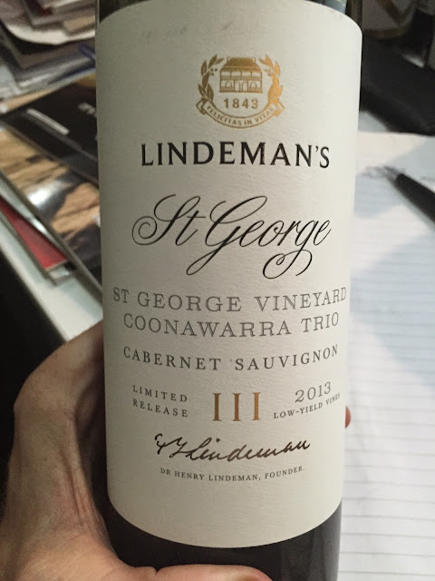
Like the new packaging? I put this picture out on twitter today and most of the feedback was negative. I think it’s ok, though it doesn’t actually improve anything – the label isn’t the problem.
What do you think?
Look, it’s going to get better but little cohesion between warm, almost spirity alcohol, coconut oak and dry tannins at the moment. I couldn’t drink it, but I’m cutting it some slack as there is promise underneath and its clearly way too young. Still…
Details: 14%, Screwcap
Tasted: April 2015, Tasting
Best drinking: 2017-2028+
Score: 16.8/20, 89/100+
Would I buy it? No.
Buy online: Not available as yet (that I can find)
P.S. Have you subscribed to the latest emails yet?
Choose from instant, daily or weekly updates. It's not an everyday thing, but a free way to get updates fast and no spam (ever).
Help keep this site paywall free – donate here


5 Comments
I do like the Label, but as you said… there was nothing wrong with the old one!
I had a 2012 St George a few weeks ago and it was great (needs time though). Sounds like the 2013
may be a bit of a miss.
Doesn't help that it's way too young – it really didn't feel together in any way, shape or form. Still didn't move me though
I think the label's good as well. That said, having written a WSET paper on labels, it's certainly hard work out there on the shelves.
Thats a really good point Sean. I remember Tahbilk doing the same thing a few years ago. They had this wonderful bright yellow label that suck out on shelves like a sore thumb. They changed their colours to black & white, and now (for me) its harder to find as its 'just another bottle in the sea of bottles' on the shelves.
I much prefer the old yellow Tahbilk labels. Distinctive. New white ones nondescript